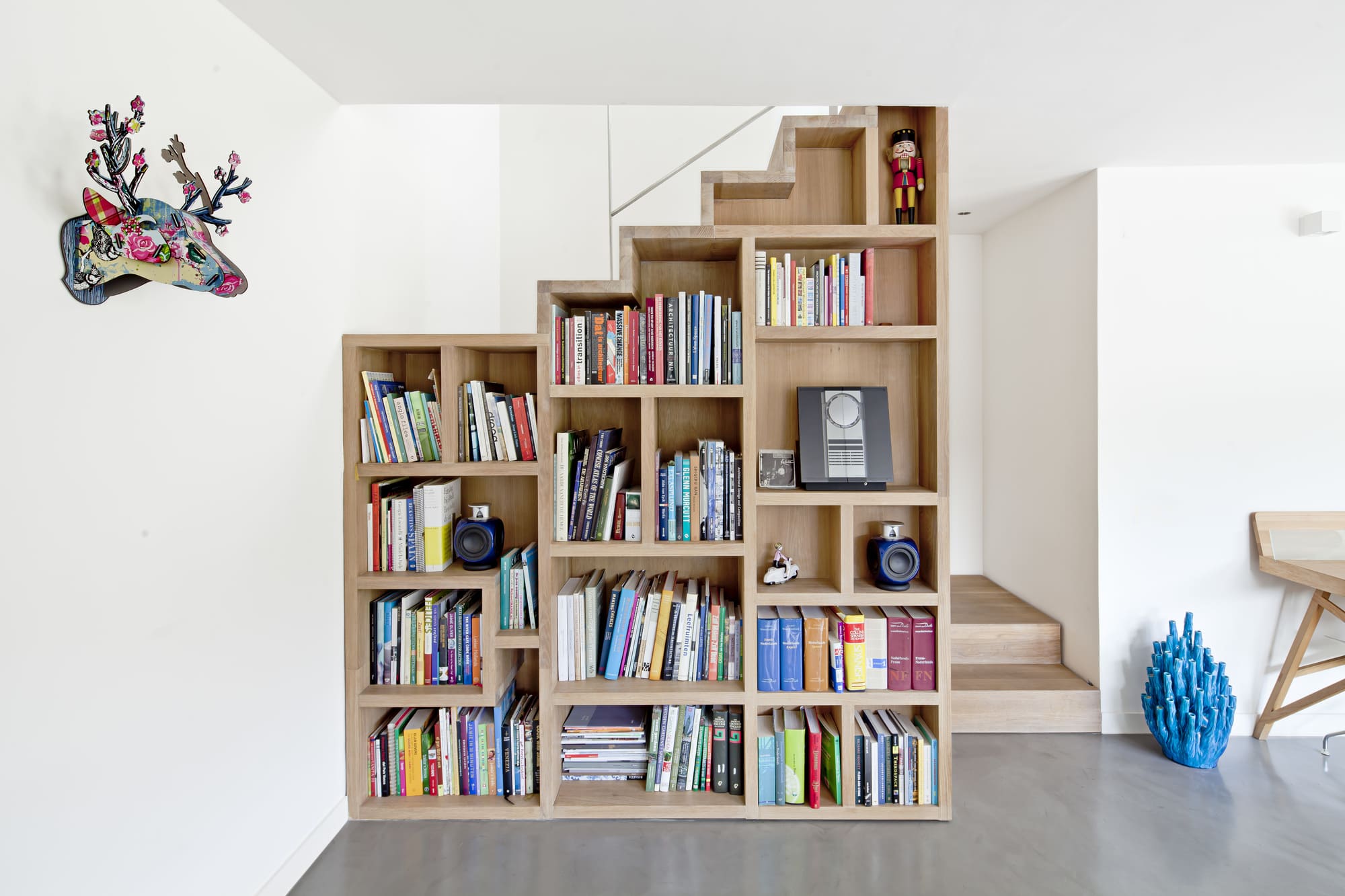
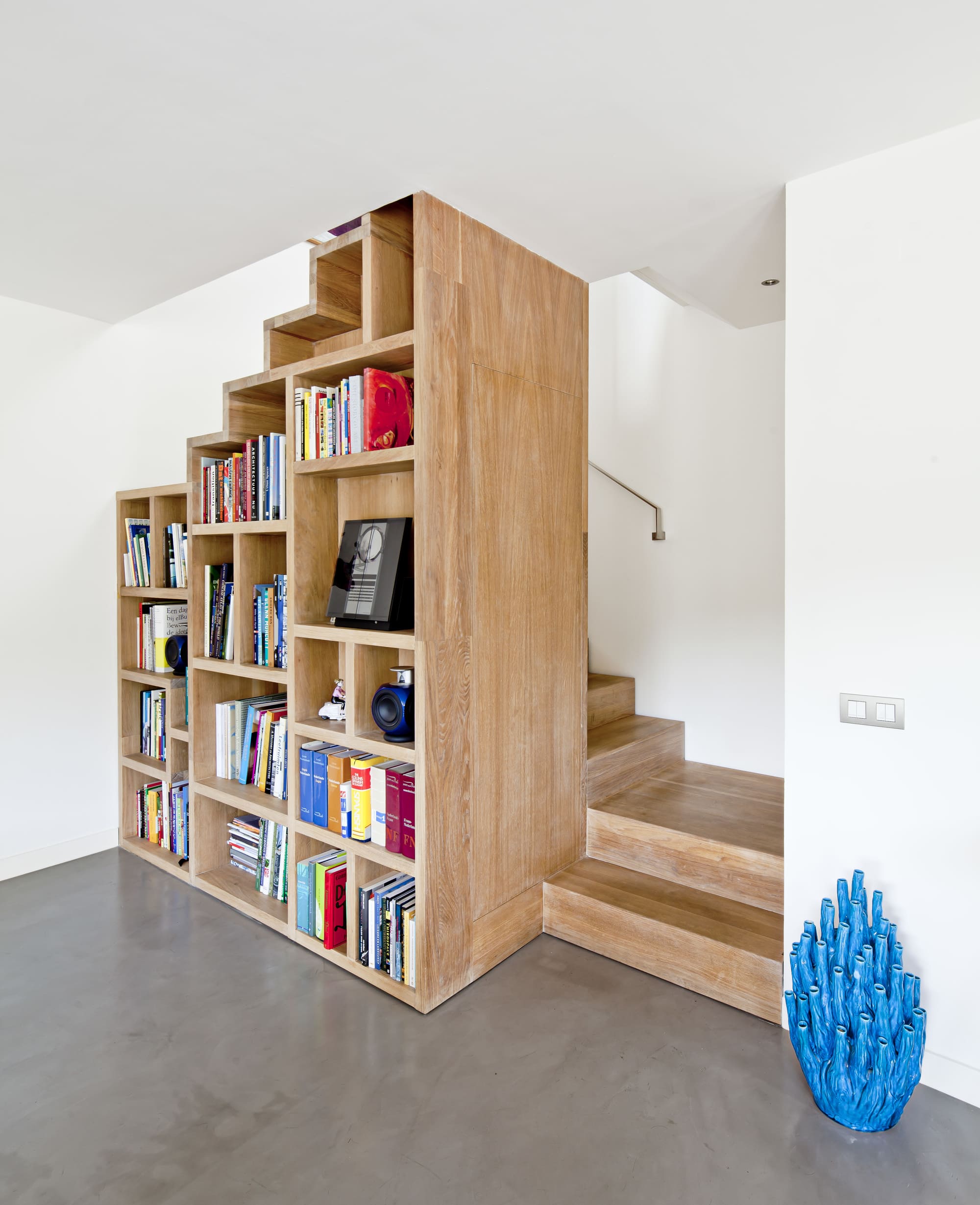
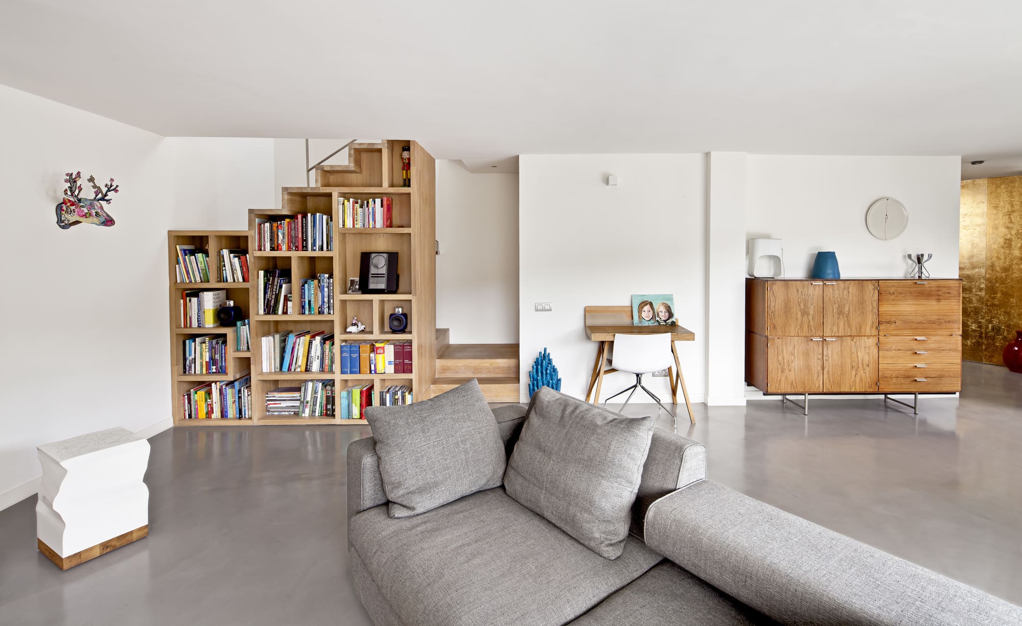
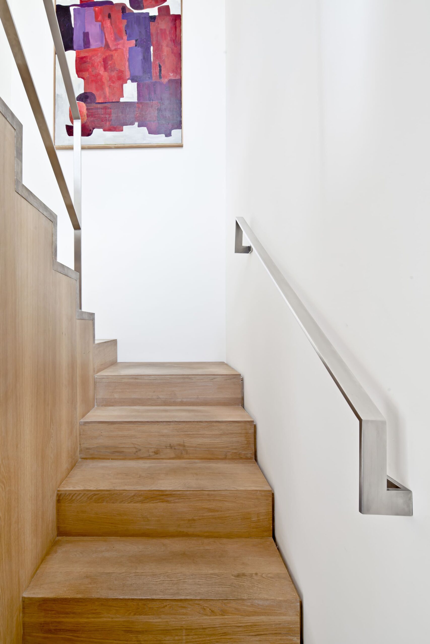
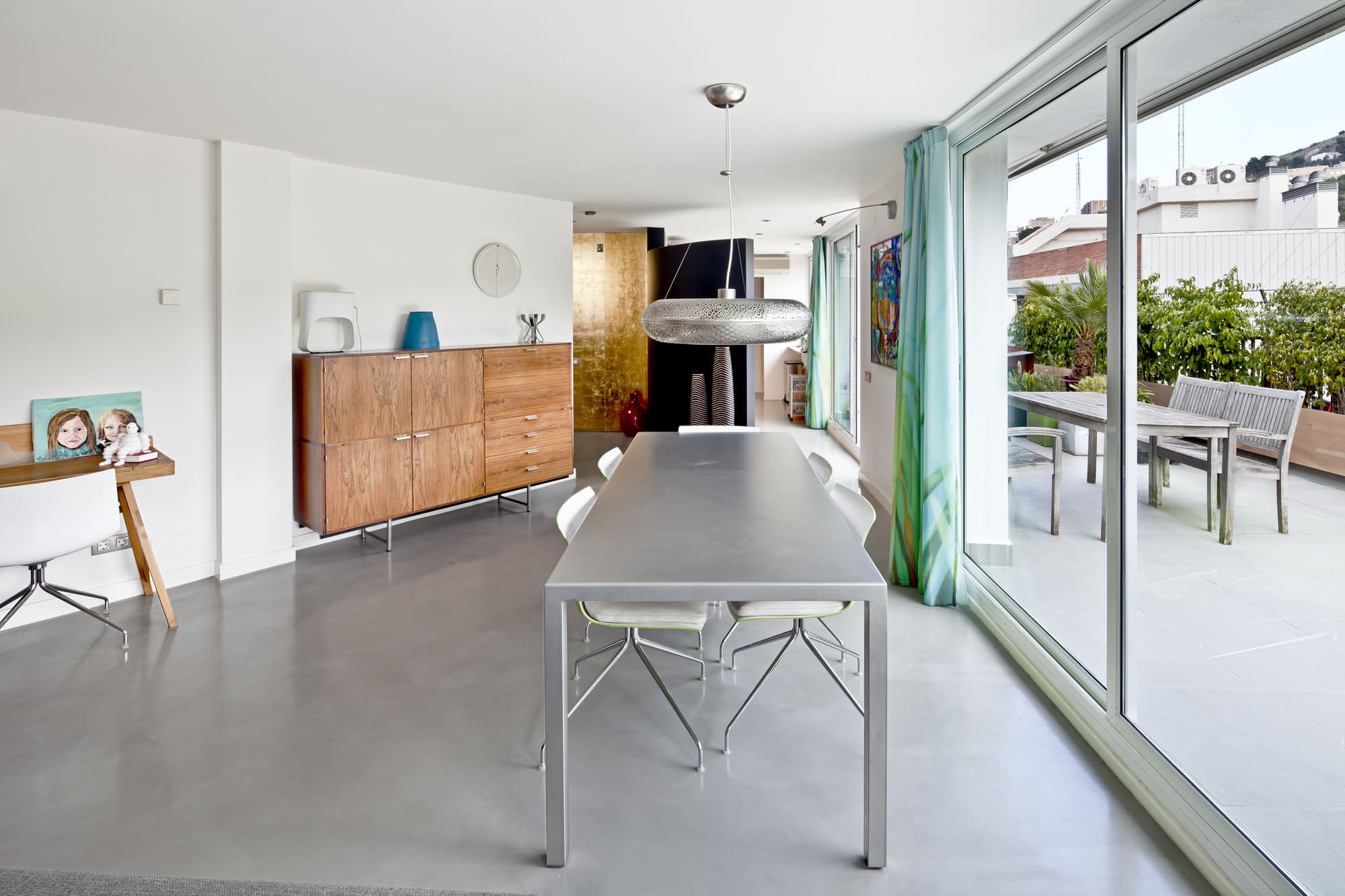
This 1970s duplex apartment had low ceilings, difficult triangular living spaces and an over-dominant staircase that stuck out into the middle of the living room. ZEST’s re-design introduces more space and light throughout as well as better storage. The original stairs wasted a lot of space. They offered hardly any storage and yet they deomated the room. Be changing the orientation and structure, we were able to find an elegant solution that holds books and hi-fi facing the living room, with a “secret” door that reveals a spacious wardrobe for coats and shoes behind the bookcase.
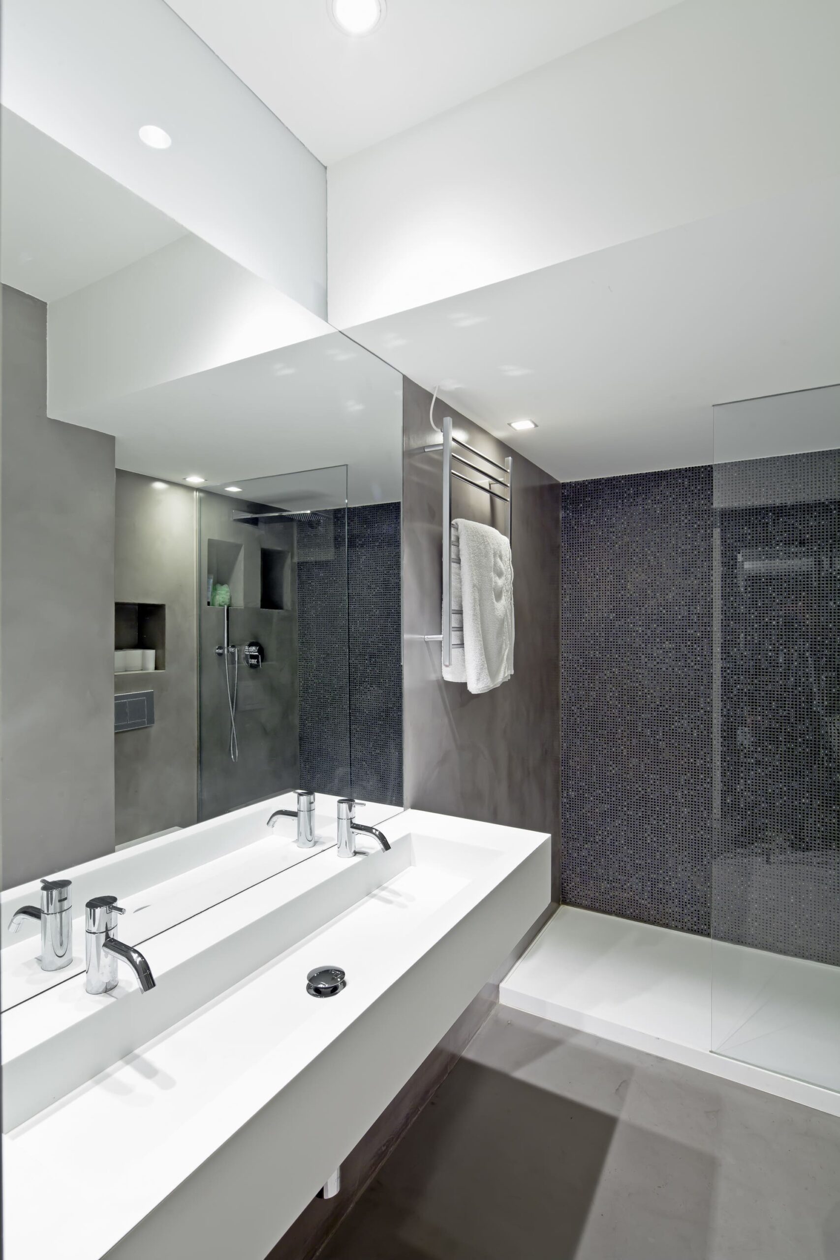
Finally, to increase the sensation of height and space, the entire structure appears to float just a few centimeters above the shiny floor of polished grey microcement. Further work concerned the re-design of the bathroom of the master bedroom, which was very small. By replacing the bath by a near-flush showerbase and by custom designing a long but narrow washbasin, the feeling of space was increased and the owners can now brush their teeth at the same time…

